This was a short clip I made for a recent brief in After Effects CS5. I was inspired by the Birmingham canals. It isn't the best of work, but I'm new to this software so its going to take some time getting used to it.
Here are some pages out of our Zine we have created. It was printed using a Riso printer. It gave a nice dotted effect on photographs and images. The size of this zine is A5 it come in colours of green & brown, The theme goes around 'England'. Our team decided to create a band that goes around the zine and a feather sicker that would hold it together. Learnt a lot of printing methods that I can use in future work out of this module.
After seeing this video I would love to produce something like this. I think ads are the microsites, brands games & social media campaigns creating engaging user environment while never leaving the magazine.
Since I'm doing 'Print' for my collab practice thought it was appropriate to show some print designs. Rise and Shine is letterpress printing studio, saw some great prints at their website (www.riseandshinepaper.com) here are just a couple I liked:
Found some really good and funny posters by Yang Liu discussing the cultural differences from East and West visually. The blue represents China and the red represents Germany. (Here just a couple I liked, there are loads more you can find on Google images)
The perception of each other
Queuing in a line
Noise level inside a restaurant
Exhibition of east meets west differences of Germany & China
Recently I've been looking at animations to do with environment here is another one of my picks.
Here's the link to her animation- http://vimeo.com/9765220
Saw this animation and thought my target audience would connect to it. The style of this animation was simple & clean cut, the colours palette used were neutral, earthy colours suited the theme perfectly. Also presented information visually well (which links back to my project I'm working on at the moment). Molly Nix the designer, created the video by first drawing the images in Adobe Illustrator and then putting it all together in After Effects. The voice recording and music were done in Apple Garage Band. When designing my animation I would like to adapt this style into my work.
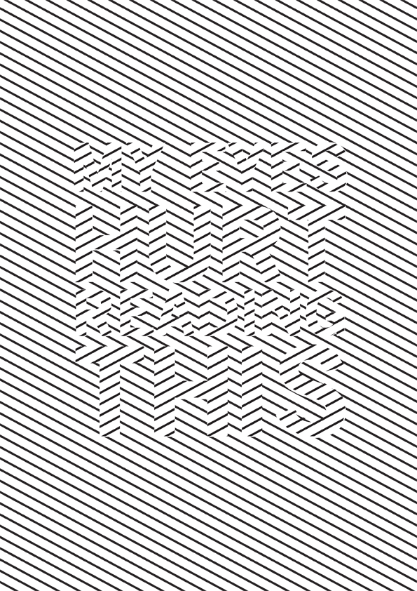
I've been working on a optical illusion poster recently inspired from Bridget Riley's 'Current' painting. I must say it was difficult designing this because my eyes did tend to hurt while working on this but one of the reasons I wanted to create this poster was to break the rules of Legibility, overall I think it worked. What do you think?
Bridget Riley is one of many practitioners that I get inspiration from. What I enjoy about her work is how something flat (2D) can turn into movement. I found this clip that describes her work.
Her Work
My favorite painting from Riley is 'Current' because it feels active, vibrate and shows movement by the juxtaposition of the black and white. Also liked how the artist expresses composure and disturbance at the same time. Each time I look at it it defy attention for instance the moment they are focused upon they disappear. They are extremely elusive things. This piece remind me of life in a way, visual sensations that pass you by in a day to day life that you can't see at that time but at the end you feel something has happened, although you can't actually name it.