Personal 2

Monday, 14 March 2011

ITAP Lecture: Information Design*

My recent ITAP lecture was on about information design. Information design is concerned with transforming data into information making the complex easier to understand and to use. From attending this lecture I learnt, the three key principles of information design are: 
1. Visual hierarchy  (type/ colour/ lines/ space).
2. Grouping information (lines/ space/ type).
3. Consistency (language/ layout).
Information design/graphics are presented everywhere for example hospitals, public signs, airports, and even motorways/roads. Famous practitioners mentioned in the lecture were people like Edward Tufte, Richard Saul Wurman, Erik Spiekermann, Paul Mijksenaar, David Sless, Rob Waller, Wim Crouwel, Neville Brody and David Carson. From this bunch of designers, the work that stood out for me and was memorable was the work of Richard Saul Wurman and Neville Brody. 


1.Richard Saul Wurman

Richard Saul Wurman is an architect and a graphic designer who is considered to be a pioneer in practice of making information easily understandable. Below is an example of information design that is visually pleasing to the eye and is simple to follow and understand. This is because by him using cyan it immediately attracts the eye especially against the white background. Shapes is also considered here, I think shapes are good to have in information graphics because it simple is clear for the audience to understand. And at the end of the day thats what it really comes down to, is if the audience understand the message the designer is showing? And I feel that Wurman achieves this in his work.   
   

2. Neville Brody 
   
Neville Brody is a British graphic designer, typographer and art director. By creating work the famous Nike ad and more posters he became very successful the perhaps is known as the best designer of his generation. Other designers soon became interested and inspired by his art work. He has designed many fonts like Arcadia, FF Gothic, Insignia and more. Brody has been the art director for 'The Face' and 'Arena' magazine' and creating really good spreads that catered to their target audience. Below are examples of layouts from these magazines.


_________________________
Written By Kawsar
Images from Google.

Saturday, 5 March 2011

Cadbury Fair Trade Chocolate


Ethics:
Recently I had an interesting lecture on Design Ethics, let me start off by saying 'What is ethics?' Ethics are motivation based on ideas of right and wrong.
picture from Google images

I wanted to talk about Cadbury dairy milk chocolate (Britain most famous chocolate) that adopting the fair trade mark. From 2009 Cadbury chocolate now contains 100% Fair Trade cocoa. Harvested in Ghana. This system allows every farmers to get paid a normal living wage. It is very common for people living in Ghana to get paid below the living wage so this was one of the reasons Cadbury wanted to help.  The growth in ethical consumption does not seem to have been effected by the recession, although fair trade believes that shoppers need to transfer good intentions into actions.


Below is a link to a video from BBC news about Cadbury fair trade chocolate: 

Cadbury celebrates the move to fair trade chocolate by creating a new advert that is all things Ghana its people, dancers, rappers and mainly its cocoa beans. the first single 'Zingolo' from 'A glass and a half full productions'. The video feature Ghana famous singer Tinny (Nii Addo Quaynor), High Spirits which is one of the best dance crew in Ghana, the campaign also features print ads designed and painted by Ghanaians using traditional techniques.


To conclude I believe the awareness of fair trade will really benefit third world countries. There are many product that contain fair trade like Costa coffee, Mars chocolate (Cadbury competitors) even boots cosmetics and much more. Also designers today needs to be both technically right and compellingly wise. Wisdom is about evaluating and choosing between competing principles. And to be wise is to be aware of current situations around the globe.

Written by Kawsar
Bibliography
www.business.timesonline.co.uk
www.odannyboy.com/blog/cmu/archives/000776.html
www.cadburydairymilk.typepad.com

Tuesday, 1 March 2011

Letterpress Experimenting

Today I went to a 'Letterpress workshop' where we were taught how to Letterpress. I learnt a lot things from the workshop that I never knew before i.e. Type height ( which is the type of the height = 0.918) etc. Also tips and tricks. This method of typography is very good and useful. I would defiantly like to use this style of printing again when working on a future project which involves typography. By using this way of working it really gives a personal feel to your work. Below is an example of the work from today...

Sunday, 27 February 2011

So-Me *Graphic Designer/Art Director

So-Me (real name: Bertrand De Langeron) is an emergent Parisian art director who specializes in vernacular typography. His name 'So-me' its originally from how artists always say the phase "That is so me..." when looking at their artwork in galleries.


His work is very colourful, complex, illustrative, bold, playful and a little nutty however it is successful, and because of this he won a lot of awards one of them includes the MTV European music awards with the talented French band called Justice (Label: Ed Bangor). Below is the music video that won this award it was produced by So-Me. The style is very colourful. He uses a lot of solid colours in his work and this is why his artwork is popular with the youths. Colour is always adapted in his work to attract the audience it is particularly presented in this video, it still works even with a background that is in black and white. I hugely enjoyed the idea of the video I feel is was very engaging. What do you think of this video?


Some of his designs are influenced by artists in the past such as Andy Warhol, Manet, Hipgnosis: T-Rex album cover etc.

For instance:
Below is the famous Marilyn Monroe painting done by Andy Warhol, which uses a lot of bright colours. And next to this is the 'Sebastian Ross Ross Ross' album cover designed by So-Me. After looking at this cover I could immediately tell that he was inspired by Warhol previous work. The key give aways to this are the bold red lips and the use of light blue in the eye.


Overall I think So-Me is very inspiring to me. I like his illustrative style and use of typography it gives it a personal, friendly atmosphere. I would love for you to let me know what do you think of his work?

*Images from internet and video from Youtube.
Written by Kawsar Ahmed
 

Thursday, 24 February 2011

Bill Bernbach Lecture 'Advertising'

Bill Bernbach (1911-1982)


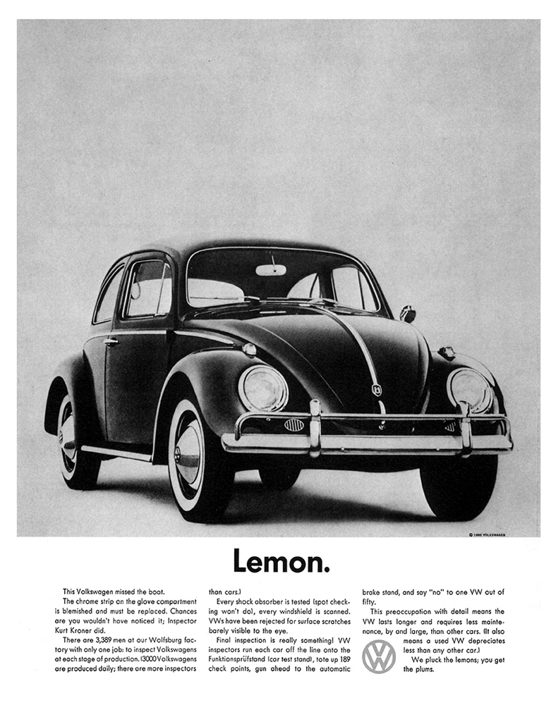
Bill Bernbach was renowned as a advertising executive. He designed many campaigns for Volkswagen cars his mos famous one was 'Think Small'He was also remembered for being one of the founding members of DDB which stands for Doyle Dane Bernbach around 1950-60s. Bernbach and DDB advertising helped separate Volkswagen from their competitors and help make their products timeless and world renowned. 


Bill Bernbach creative team approach when designing the campaigns had humor, i.e Lemon etc (which was at that time 'Lemon' was an insult). He also took risks and broke the rules. for example the think small campaign, which was simple, clean cut and sophisticating. Bill Bernbach intelligent approach toward the audience was new at that lime compared with other advertising agencies. 


He also worked with Paul Rand which at the time was usual because art director and copy writer kept to themselves and it was wrong to be seen with them let alone work with them, however Bill Bernbach changed that and the advertising industry.  


Examples of his work:


My personal favorite advertisement that DDB designed was the 'pick the right day to test drive a VW and you'll have the road to yourself' because it lets the audience think and search  for the product. He executed this perfectly due to of his creative strategy which was everything in the image is pointed toward the product i.e. the title leads the eye to the car which is faded. I can tell that he was inspired from Leonardo Da Vinci 'The last supper' painting because Bernbach uses perspective in the painting.   


Monday, 13 December 2010

Production: ITAP lecture 9

This week my ITAP lecture was about production. Highlighted in red are the two principles I decided to write about today. The 5 key principles from my lecture were the following:
1. A brief history of production
2. Essential Milestones
3. The design workflow
4. From novice to expert
5. The experts
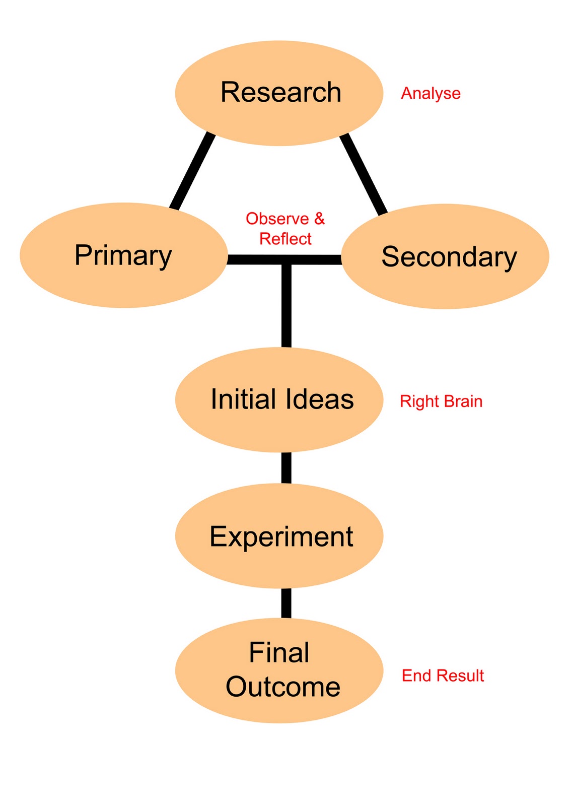
I have produced a simple diagram showing my workflow (below). I believe this workflow diagram works when having a three week project brief, because it can be easily adapted to my work. This diagram helps me because it also has a good structure for example in week one: Research (primary & secondary), week two: Initial ideas and experimenting, week three: Final outcome. So it keeps me on schedule and it is easy to plan ahead.

Designed by Kawsar Ahmed

Who is your favourite expert & why?
My Design Workflow 
 
Alexey Brodovitch (historical) & Tarek Atrissi (contemporary)
There are many favourite designers and art directors that I personally like and follow. However I will be discussing only two designers that have inspired me. One is Alexey Brodovitch a famous historical art director and second is a contemporary graphic designer called Tarek Atrissi. The reason why these two are one of my favourite are as follows;

Alexey Brodovitch (1898-1971)     


·         Brodovitch was a pioneer in graphic design. He bought modernist ideas, he was also the first art director to integrate image and text in covers of ‘Harper Bazaar magazine’ and was known for contradicting himself. There are number of things that interest me about his work, I will name a couple.
·         Firstly, he used fresh innovative ideas. For instance this is when he designed a poster for an upcoming ball competition, which won 1st place from contestants like Picasso and other good designer/artists.
·        Secondly, in the 1950’s he perfected his style of using crisp, sharp composition of text and photography with white space he used this in magazine layouts and covers.

      One of my favourite quote from Brodovitch was "We learn by making mistakes. We must be critical of ourselves and have the courage to start all over again after each failure. Only then do we really absorb, really
      start to know."

Tarek Atrissi
·         Tarek Atrissi is a Netherland based designer. Who has a unique style of interpreting his Arabic heritage in a modern way.
·         He designs and experiment with a lot of different mediums like websites, posters, logo design, packaging, broadcast design, newspaper design and even fashion. I particularly admire his Arabic typography/calligraphy. For example his logo for the country of Qatar (below) shows his creative thinking and his idea.  


This is a simple calligraphic logo which became a famous icon for the tourism sector across the Middle East. The colours all connects together, the blue symbolises the water and hospitality, the orange & red representing the sun and desert. I can see that he really focussed on getting the colours right by testing them out. “To a non Arab speaking person, the Qatar (Arabic text) becomes endless abstract shapes, a smiley face, dunes, waves. The logo starts as calligraphy but it then becomes more of an icon”, said by Atrissi.

Bibliography
Pictures from ‘Google Images’

Monday, 6 December 2010

Image and Text (ITAP Critical Commentry)

Integrating Theory and Practice: Image and text
(Level 4) Lecture 8
Last week I had a lecture on image and text, it was basically talking about how photographer uses text on their photos to express emotions or text could be used to describe the image. To name examples of good photographers who use text in their work are Gillian Wearing, Rene Magritte, Jim Goldberg, Barbara Kruger and John Heartfield. When observing each of these photographers work more thoroughly I noticed that without the text the message the photographer is sending might not come through as best as it can with text. Today I will write about how ‘how text can influence our emotions’ and ‘how text can be added to change the context of an image.
How text can influence our emotions
John Heartfield
John Heartfield is best known for his photomontages of Hitler. Hitler came to power in 1933 then John Heartfield was forced to leave the country. His work photos show photomontage with a political message. Below is one example of his photomontages. It shows Hitler sharpening his knife to kill a chicken. However the title is ‘don’t be afraid Hitler is a vegetarian’ so it’s ironic and to the left is the Heartfield. This image was for a magazine, at the bottom of the photo I can see the text and it is describing the photo.  
Artist: John Heartfield -‘Don’t be afraid Hitler is a vegetarian’
My work from a photography project

Below is an example where I used photomontage and text for a project that I done last year. The image is to show the transition to basic materials to mechanical or how time has change throughout the years of architecture. Before starting my work I had to find examples of artists in the past who used photomontage, this was when I came across John Heartfield, other photographers I looked at was Hannah Hoch and Raoul Hausmann. At that time when producing the work I knew a little of how to use Photoshop however by looking back at my work now there are a few things to improve on one being to handwrite the text to make it feel personal and to connect with the audience.  


Artist: Kawsar Ahmed

How text can be added to change the context of an image

Example 1:


This is an example of how text can be added to change the context of a photo. When first looking at the photograph without the text I wanted to know the background of these kids and why the photographer chosen to take this particular image. I later found the poster which is presented to the right above. This made it clear to me that the kids where from Cambodia and suffering from poverty and injustice there are more information about life in Cambodia as a child below the heading of poster. The poster was to inform the audience that there was an photography exhibition to raise money for the children of Cambodia.   

Written by Kawsar Ahmed

*Image: both from Google Images