Personal 2

Sunday, 27 February 2011

So-Me *Graphic Designer/Art Director

So-Me (real name: Bertrand De Langeron) is an emergent Parisian art director who specializes in vernacular typography. His name 'So-me' its originally from how artists always say the phase "That is so me..." when looking at their artwork in galleries.


His work is very colourful, complex, illustrative, bold, playful and a little nutty however it is successful, and because of this he won a lot of awards one of them includes the MTV European music awards with the talented French band called Justice (Label: Ed Bangor). Below is the music video that won this award it was produced by So-Me. The style is very colourful. He uses a lot of solid colours in his work and this is why his artwork is popular with the youths. Colour is always adapted in his work to attract the audience it is particularly presented in this video, it still works even with a background that is in black and white. I hugely enjoyed the idea of the video I feel is was very engaging. What do you think of this video?


Some of his designs are influenced by artists in the past such as Andy Warhol, Manet, Hipgnosis: T-Rex album cover etc.

For instance:
Below is the famous Marilyn Monroe painting done by Andy Warhol, which uses a lot of bright colours. And next to this is the 'Sebastian Ross Ross Ross' album cover designed by So-Me. After looking at this cover I could immediately tell that he was inspired by Warhol previous work. The key give aways to this are the bold red lips and the use of light blue in the eye.


Overall I think So-Me is very inspiring to me. I like his illustrative style and use of typography it gives it a personal, friendly atmosphere. I would love for you to let me know what do you think of his work?

*Images from internet and video from Youtube.
Written by Kawsar Ahmed
 

Thursday, 24 February 2011

Bill Bernbach Lecture 'Advertising'

Bill Bernbach (1911-1982)


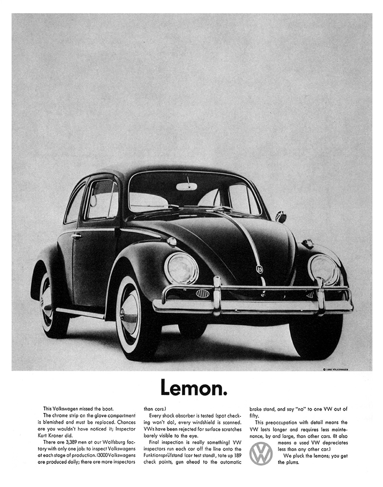
Bill Bernbach was renowned as a advertising executive. He designed many campaigns for Volkswagen cars his mos famous one was 'Think Small'. He was also remembered for being one of the founding members of DDB which stands for Doyle Dane Bernbach around 1950-60s. Bernbach and DDB advertising helped separate Volkswagen from their competitors and help make their products timeless and world renowned. 


Bill Bernbach creative team approach when designing the campaigns had humor, i.e Lemon etc (which was at that time 'Lemon' was an insult). He also took risks and broke the rules. for example the think small campaign, which was simple, clean cut and sophisticating. Bill Bernbach intelligent approach toward the audience was new at that lime compared with other advertising agencies. 


He also worked with Paul Rand which at the time was usual because art director and copy writer kept to themselves and it was wrong to be seen with them let alone work with them, however Bill Bernbach changed that and the advertising industry.  


Examples of his work:


My personal favorite advertisement that DDB designed was the 'pick the right day to test drive a VW and you'll have the road to yourself' because it lets the audience think and search  for the product. He executed this perfectly due to of his creative strategy which was everything in the image is pointed toward the product i.e. the title leads the eye to the car which is faded. I can tell that he was inspired from Leonardo Da Vinci 'The last supper' painting because Bernbach uses perspective in the painting.   


Monday, 13 December 2010

Production: ITAP lecture 9

This week my ITAP lecture was about production. Highlighted in red are the two principles I decided to write about today. The 5 key principles from my lecture were the following:
1. A brief history of production
2. Essential Milestones
3. The design workflow
4. From novice to expert
5. The experts
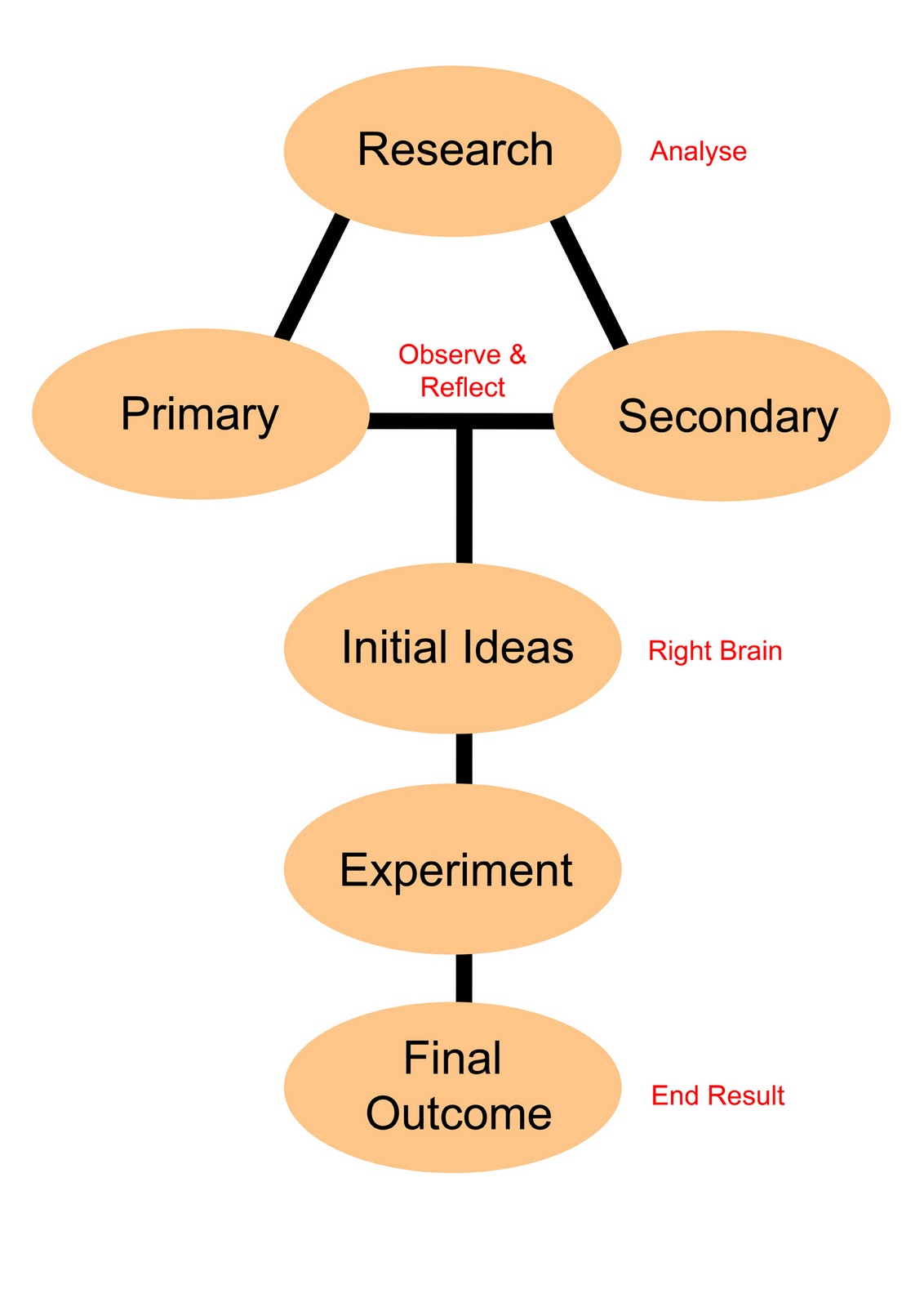
I have produced a simple diagram showing my workflow (below). I believe this workflow diagram works when having a three week project brief, because it can be easily adapted to my work. This diagram helps me because it also has a good structure for example in week one: Research (primary & secondary), week two: Initial ideas and experimenting, week three: Final outcome. So it keeps me on schedule and it is easy to plan ahead.

Designed by Kawsar Ahmed

Who is your favourite expert & why?
My Design Workflow 
 
Alexey Brodovitch (historical) & Tarek Atrissi (contemporary)
There are many favourite designers and art directors that I personally like and follow. However I will be discussing only two designers that have inspired me. One is Alexey Brodovitch a famous historical art director and second is a contemporary graphic designer called Tarek Atrissi. The reason why these two are one of my favourite are as follows;

Alexey Brodovitch (1898-1971)     


·         Brodovitch was a pioneer in graphic design. He bought modernist ideas, he was also the first art director to integrate image and text in covers of ‘Harper Bazaar magazine’ and was known for contradicting himself. There are number of things that interest me about his work, I will name a couple.
·         Firstly, he used fresh innovative ideas. For instance this is when he designed a poster for an upcoming ball competition, which won 1st place from contestants like Picasso and other good designer/artists.
·        Secondly, in the 1950’s he perfected his style of using crisp, sharp composition of text and photography with white space he used this in magazine layouts and covers.

      One of my favourite quote from Brodovitch was "We learn by making mistakes. We must be critical of ourselves and have the courage to start all over again after each failure. Only then do we really absorb, really
      start to know."

Tarek Atrissi
·         Tarek Atrissi is a Netherland based designer. Who has a unique style of interpreting his Arabic heritage in a modern way.
·         He designs and experiment with a lot of different mediums like websites, posters, logo design, packaging, broadcast design, newspaper design and even fashion. I particularly admire his Arabic typography/calligraphy. For example his logo for the country of Qatar (below) shows his creative thinking and his idea.  


This is a simple calligraphic logo which became a famous icon for the tourism sector across the Middle East. The colours all connects together, the blue symbolises the water and hospitality, the orange & red representing the sun and desert. I can see that he really focussed on getting the colours right by testing them out. “To a non Arab speaking person, the Qatar (Arabic text) becomes endless abstract shapes, a smiley face, dunes, waves. The logo starts as calligraphy but it then becomes more of an icon”, said by Atrissi.

Bibliography
Pictures from ‘Google Images’

Monday, 6 December 2010

Image and Text (ITAP Critical Commentry)

Integrating Theory and Practice: Image and text
(Level 4) Lecture 8
Last week I had a lecture on image and text, it was basically talking about how photographer uses text on their photos to express emotions or text could be used to describe the image. To name examples of good photographers who use text in their work are Gillian Wearing, Rene Magritte, Jim Goldberg, Barbara Kruger and John Heartfield. When observing each of these photographers work more thoroughly I noticed that without the text the message the photographer is sending might not come through as best as it can with text. Today I will write about how ‘how text can influence our emotions’ and ‘how text can be added to change the context of an image.
How text can influence our emotions
John Heartfield
John Heartfield is best known for his photomontages of Hitler. Hitler came to power in 1933 then John Heartfield was forced to leave the country. His work photos show photomontage with a political message. Below is one example of his photomontages. It shows Hitler sharpening his knife to kill a chicken. However the title is ‘don’t be afraid Hitler is a vegetarian’ so it’s ironic and to the left is the Heartfield. This image was for a magazine, at the bottom of the photo I can see the text and it is describing the photo.  
Artist: John Heartfield -‘Don’t be afraid Hitler is a vegetarian’
My work from a photography project

Below is an example where I used photomontage and text for a project that I done last year. The image is to show the transition to basic materials to mechanical or how time has change throughout the years of architecture. Before starting my work I had to find examples of artists in the past who used photomontage, this was when I came across John Heartfield, other photographers I looked at was Hannah Hoch and Raoul Hausmann. At that time when producing the work I knew a little of how to use Photoshop however by looking back at my work now there are a few things to improve on one being to handwrite the text to make it feel personal and to connect with the audience.  


Artist: Kawsar Ahmed

How text can be added to change the context of an image

Example 1:


This is an example of how text can be added to change the context of a photo. When first looking at the photograph without the text I wanted to know the background of these kids and why the photographer chosen to take this particular image. I later found the poster which is presented to the right above. This made it clear to me that the kids where from Cambodia and suffering from poverty and injustice there are more information about life in Cambodia as a child below the heading of poster. The poster was to inform the audience that there was an photography exhibition to raise money for the children of Cambodia.   

Written by Kawsar Ahmed

*Image: both from Google Images

Sunday, 28 November 2010

ITAP: Critical Commentary

(Level 4) Lecture 7
This week I had a lecture on ‘Development of Creative Thought and Structure in Illustration and Graphic Art’. The key principles were:
1. Overcoming Mindsets
2. Getting Rid of Assumptions
3. Restating Problems
4. Developing Ideational Fluency
5. Managing a Creative Environment  
I would be discussing Principe’s 3 & 4 pacifically today.
Restating Problems
Restating your problems basically mean finding an interesting way to redefine the problem. Designers/artists often have to imaginatively challenge problems from different angles. The designers or artists develop an idea and within an idea, the possibility of designing the one original idea has variety of possibilities/outcomes.
If making a visual list of 50-75 ideas. The first 20-30 would be those you are most familiar with, but the bigger the list the greater the probability of achieving original insight as a result of the fusion of two or more ideas.
You could also think of ways of producing it not going for the obvious thinking outside the box or even breaking the rules of design.  For example my recent project I am working on at the moment is to redesign a guide for new students coming to BIAD next year. I considered using graphic illustration because it felt that playful, handmade to feel personal for the target audience which is students. Also thought of using colour because it’s more attractive and would catch the eye of my target audience rather than black & white. I wanted to look at other ways of presenting this information, for instance I could design a mini animation, print campaign or could be web-based this is me thinking outside the box and looking at the design from the audiences point of view.
Developing Ideational Fluency
Ideational fluency can be defined as easily produced ideas that fulfil certain requirements and this can be achieved through tools such as classification, brainstorming and mind mapping. Ideational fluency refers to the quantity and diversity, but not necessarily the quality of ideas.
Classification is where ideas can be organised by recognising both obvious as well as hidden common denominators, sometimes removing artificial boundaries and generating diverse connections.
Brainstorming is an opportunity to develop impulsive thinking and generate more ideas.
Mind Mapping allows you the ability to organise the thought processes as a network, encouraging associations between different thoughts.
Below is my final major project (FMP) brainstorm image from my sketchbook. When brainstorming it helped me drop down my idea when inspiration came.


Image from Kawsar Ahmed


Rob Ryan is a British artist who majority of work is papercutting and screenprinting. He had designed illustration for books, album covers, greeting cards and magazines.

When recently reading the October issue of Computer Arts magazine, I fell across a page on how to make ‘stunning papercuts the easy way’ and found it very useful in fact so much that I consider doing it. If you are interested in learning the technique it’s on page 64.
Written by Kawsar Ahmed
Image courtesy of http://mr--yen.blogspot.com/
 

Monday, 15 November 2010

ITAP -Production and Outcomes

(Level 4) ITAP lecture 6

This week I had an integrating theory and practice (ITAP) lecture about production & outcome. The five key principles of this lecture are Interpretation, Delivery, Medium, Testing, and Methodology. And today I will discuss the principles of Testing your work and Delivery.

Testing your work
Illustrators can gain feedback and reaction of their work from the public through galleries, websites, blogs, social forums and many more. This information is then up to the artists to improve or adjust the work to suit the needs of their target audience.
For Instance when reading the recent issue of ‘Computer Arts’ magazine I came across ‘Yuta Onoda’ is a Japan illustrator and painter based in Toronto, Canada. After a year from graduating he has been very successful winning several awards and having commissions from magazines like Eye weekly, Ez Magazine, How Magazine, Beehive Design, Imagine Native, Ink Publishing and more. Onoda was published in Computer Arts magazine as a upcoming artist. Being featured in the magazine is promoting himself and his work is becoming known from a globally. The magazine spreads had images of his work and this would engage the audience. To read the full interview of Yuta Onoda then visit http://www.computerarts.co.uk/in_depth/interviews/yuta_onoda. He has a blog that he can receive comments from the public.  


*Pictures courtesy from Yuta Onoda blog.


You can get feedback and reactions from the art professionals by entering art competitions for example the annual D&AD.

Delivery
There has never been a better time for the potential applications for illustration. Creative outputs now include collectable designer toys, fashion clothes, plates, furniture, etc.

Many illustrators today will simply not wait for markets to emerge but instead find other ways to get there work across for example self-publishing fanzines and magazines; launching own-label products, flick books and stickers, badges, T shirts as well as promoting self initiated limited edition artworks through the use of online websites and more traditional gallery shows.

For instance ‘Diggy Smerdon’ is a contemporary artist & illustrator. Her expressive raw lines and distinct forms make her work unique and mysterious. Her talent also extent into further realms as she has unleashed her quirky and beautiful creations on to everything from album covers, to T- shirts and surfboards.

Below are pictures from one of my favourites and a link to a video clip showing Diggy creating custom art surfboard. This clip also shows her process from painting the artwork on to the blank step by step of glassing the board and finishing it off ready to wax up and to use. The board was commissioned by Panda Eye surf.

*http://www.diggysmerdon.com/ (video clip at bottom of page) 


To conclude I believe that there are many ways artists and designers can present their art work do gain valuable feedback from the public. This enables the designers to improve and adapt their ideas to satisfy their chosen target audience. Also I feel that particularly Illustrators have a range of platforms to express their work on, a big improvement from past years experiences.


Written by Kawsar Ahmed

Bibliography

This video clip was sponsored by Avalaan.

Sunday, 7 November 2010

ITAP; Development of Ideas and Structure in Moving Image


Analysing the structure of Twilight movie

This week I will be discussing about story development in a three act structure, and I would be expressing these key points why watching the movie ‘Twilight’. I will also show how ‘The Sarah Jane Adventure’ (TV series) extended the platform to engage audience.
Principe 1; Story Development

‘Twilight’ is a vampire movie originally based upon the famous book series by author Stephanie Meyer. This is the first movie of the Twilight Saga. So this movie is split into 3 sections Beginning; Middle; End.
The movie is told by Bella point of view. The beginning (30 minutes) of the movie, she moves to ‘Forks’ a small town in Washington DC to live with her father ‘Charlie’. She gets used to her new surroundings, and starts high school. Bella meets Edward Cullen in biology class and she starts noticing little odd habits. Then later Edward saves Bella’s life from a car accident and it’s from here that she becomes drawn to him. And questions Edward on how he came so fast to her from a length of space.  

Then a series of events happen to Bella which ends up of Edward saving her again and their relationship progresses.
The Middle of the movie is mostly about Bella & Edward and James (a nomadic vampire). It starts off by Edward inviting Bella to go play baseball with his family. This is when they meet ‘The Nomadic Vampire’ who killed Charlie good friend. The three members of this group are Laurent (who seems to be the leader), Victoria (James girlfriend) and James (a tracker- who harms Bella). The Cullen family plans to kill James to save Bella. Bella leaves Forks to protect her father from the situation she’s in. The family splits up two protecting Bella and the other half trying to stir James on a wrong path. However this plan backfire and James makes a call to Bella threatening to kill her mother. So she agrees to come to James alone to save her. But later finds out it was a trap. James twists and bites her wrist.

The ending, Edward comes to Bella rescue and kills James. Then Edward sucks the venom out of her system. After a couple of days Bella goes to prom with Edward. The end shot is of Victoria watching them dancing of which they are unaware. Victoria plays a big part in the next movie ‘New Moon’ from the Twilight Saga.  
Overall I found the movie enjoyable and good to watch. You could watch the movie on YouTube (but they aren’t in HD) or you can buy the movie. I would say the protagonist in this movie would be Edward Cullen. In his past he admitted that he killed people however in this story we see him as the Hero.    

Principe 5; Digital Storytelling   

‘The Sarah-Jane Adventures’ is a TV series following the show of Doctor Who but its targeted for a younger audience. When going to their website I notice a variety of clips and episodes to engage and increase the audience. I’d seen beautiful illustrated comic strips, exclusive videos, games, character interviews and much more. The website layout is also straight forward. I was worried before because i wondered how they will put all this information in and still make it look clear and simple for kids to use.
The use of colour and pictures enhance the target audience to o to the website and even watch the episodes.
Here’s a link to their website, http://www.bbc.co.uk/cbbc/sja/
What do you think of it?